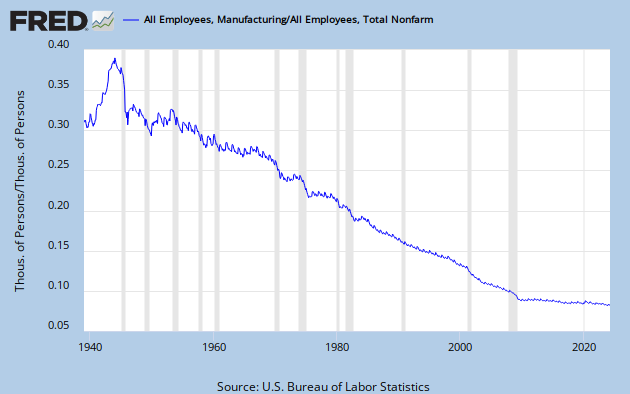
Print Friendly, PDF & Email

US Government Employment

 
Manufacturing Employment As A Percent Of Employment

USGOVT
MANEMP/PAYNSA
Share

22 thoughts on “A Tale of Two Graphs

  1. Kevin Johnson says:

    WOW!
    A picture is worth a thousand words. …or in this case, characters:
    #%!$#&!$#&!!!!….

  2. Kevin Johnson says:

    WOW!
    A picture is worth a thousand words. …or in this case, characters:
    #%!$#&!$#&!!!!….

  3. Mike Gugger says:

    Miles,
    where I agree that this seems like a striking correlation, what I don’t agree with is the premise it tries to deliver. Yes we have lost all those jobs in manufacturing and this is indeed a terrible thing. And yes again jobs in government have jumped through that time. What this does not take into account is that our productivity per manufacturing worker has increased exponentially over that time and that our manufacturing output over that time has significantly increased in spite this reduction in workforce. We still out produce every country in the world. Productivity is the key not job protection. This is the same mistake that unions make. They are looking to protect the number of jobs not the competitiveness of the those jobs.
    What happens in 10-15 more years when the B-Boomers retire? Who’s going to fill jobs then? The next generation and subsequent ones don’t seem to be interested in manufacturing, so productivity per individual in the market has to increase for this country to stay economically competitive. Same has happened in agriculture. Sure family farms have diminished to a miniscule level. But the amount of food we produce in this country alone could feed the world (if we stopped feeding soy and corn to cattle).
    You do not provide the complete picture. Nor do you provide insight into how to move forward. Do we need jobs in manufacturing to build wealth in this country? Absolutely! Value added production is the only way to build wealth. Does it have anything to do with an increase in government jobs? No it does not!
    MDG

  4. Mike Gugger says:

    Miles,
    where I agree that this seems like a striking correlation, what I don’t agree with is the premise it tries to deliver. Yes we have lost all those jobs in manufacturing and this is indeed a terrible thing. And yes again jobs in government have jumped through that time. What this does not take into account is that our productivity per manufacturing worker has increased exponentially over that time and that our manufacturing output over that time has significantly increased in spite this reduction in workforce. We still out produce every country in the world. Productivity is the key not job protection. This is the same mistake that unions make. They are looking to protect the number of jobs not the competitiveness of the those jobs.
    What happens in 10-15 more years when the B-Boomers retire? Who’s going to fill jobs then? The next generation and subsequent ones don’t seem to be interested in manufacturing, so productivity per individual in the market has to increase for this country to stay economically competitive. Same has happened in agriculture. Sure family farms have diminished to a miniscule level. But the amount of food we produce in this country alone could feed the world (if we stopped feeding soy and corn to cattle).
    You do not provide the complete picture. Nor do you provide insight into how to move forward. Do we need jobs in manufacturing to build wealth in this country? Absolutely! Value added production is the only way to build wealth. Does it have anything to do with an increase in government jobs? No it does not!
    MDG

  5. speakingofprecision says:

    Mike, I just provided the facts so that I was “not coloring” their perception. I’m all about inferences.
    I think that we all agree about manufacturing productivity gains, and agree that technology has played an important role in increasing manufacturing productivity.
    BUT- that begs the question, “Why haven’t those Technology productivity gains been applied in whatever it is the USGOVT indicator measures? Why is that growing at multiples of poulation growth? Why don’t technology and productivity gains “scale” in USGOVT?”
    I would submit that the ~3 times multiple of population growth of USGOVT does have something to do with our ability to create jobs in manufacturing.
    I would say it by using the words “PARASITIC LOAD.” Just like a generator or car engine can be stalled out when too much load is applied. Thanks for the thoughtful comment!

  6. speakingofprecision says:

    Mike, I just provided the facts so that I was “not coloring” their perception. I’m all about inferences.
    I think that we all agree about manufacturing productivity gains, and agree that technology has played an important role in increasing manufacturing productivity.
    BUT- that begs the question, “Why haven’t those Technology productivity gains been applied in whatever it is the USGOVT indicator measures? Why is that growing at multiples of poulation growth? Why don’t technology and productivity gains “scale” in USGOVT?”
    I would submit that the ~3 times multiple of population growth of USGOVT does have something to do with our ability to create jobs in manufacturing.
    I would say it by using the words “PARASITIC LOAD.” Just like a generator or car engine can be stalled out when too much load is applied. Thanks for the thoughtful comment!

  7. speakingofprecision says:

    Thanks for not providing all 1000 characters Kevin!

  8. speakingofprecision says:

    Thanks for not providing all 1000 characters Kevin!

  9. matt w says:

    both graphs are distorted by not showing 0 on the y axis. It over emphasizes the real change in range.
    These are not stock market price graphs where the range is significantly truncated so that fluctuations can be seen. It would only take one more tick to remove the visual deception from these images.

  10. matt w says:

    both graphs are distorted by not showing 0 on the y axis. It over emphasizes the real change in range.
    These are not stock market price graphs where the range is significantly truncated so that fluctuations can be seen. It would only take one more tick to remove the visual deception from these images.

  11. speakingofprecision says:

    Matt, thanks for the comment.
    I posted the graphs directly as taken from the St.Louis Fed’s website. I am not going to be the guy to tell them about graphical integrity.
    I am not sure that the zero would add any clarity, since the graphs are really just showing the change for a similar time period. I’m also not sure I see how additional empty space on a redrawn graph would add any value. Maybe I’ll get a chance to grab the data from the Fed and redraw the m to see over the weekend.
    Thanks for sharing your thoughts.

  12. speakingofprecision says:

    Matt, thanks for the comment.
    I posted the graphs directly as taken from the St.Louis Fed’s website. I am not going to be the guy to tell them about graphical integrity.
    I am not sure that the zero would add any clarity, since the graphs are really just showing the change for a similar time period. I’m also not sure I see how additional empty space on a redrawn graph would add any value. Maybe I’ll get a chance to grab the data from the Fed and redraw the m to see over the weekend.
    Thanks for sharing your thoughts.

  13. matt w says:

    No need to spend any time on this at all. You presented the data as you got it and I respect that – I did not at all mean to imply that you were behind the deception.
    Conveying information through pictures is an art more than a science, I was just giving my interpretation.

  14. matt w says:

    No need to spend any time on this at all. You presented the data as you got it and I respect that – I did not at all mean to imply that you were behind the deception.
    Conveying information through pictures is an art more than a science, I was just giving my interpretation.

  15. Eric Kline says:

    Pretty interesting. The govt employment graph however is raw numbers, whereas the mfg employment is as a percentage of employees. So it brings up two questions to me: how has employment as percentage of population changed over that time (length of retirement, women in workforce, etc), and how has population changed (it went from 130MM to 310MM between 1940 and 2010)? If the govt workforce as percentage of US population were shown, it would still show growth, but by a factor of 2.5x instead of 6x. Also, thinking about women, they were certainly doing a lot of work in the 1950’s, but they weren’t counted as employees when they were doing laundry, cooking, and child rearing. Think about how many jobs today are related to food service and child care, and it seems like a significant chunk of the economy was added to the employment roll.

  16. Eric Kline says:

    Pretty interesting. The govt employment graph however is raw numbers, whereas the mfg employment is as a percentage of employees. So it brings up two questions to me: how has employment as percentage of population changed over that time (length of retirement, women in workforce, etc), and how has population changed (it went from 130MM to 310MM between 1940 and 2010)? If the govt workforce as percentage of US population were shown, it would still show growth, but by a factor of 2.5x instead of 6x. Also, thinking about women, they were certainly doing a lot of work in the 1950’s, but they weren’t counted as employees when they were doing laundry, cooking, and child rearing. Think about how many jobs today are related to food service and child care, and it seems like a significant chunk of the economy was added to the employment roll.

  17. Eric Kline says:

    Cool info, by the way, and my previous comment was just some of the other interesting points it made me think about.

  18. Eric Kline says:

    Cool info, by the way, and my previous comment was just some of the other interesting points it made me think about.

  19. speakingofprecision says:

    Thanks Eric. You make a great point about the un compensated labor of housewives in the 1950’s. Thanks for connecting.

  20. speakingofprecision says:

    Thanks Eric. You make a great point about the un compensated labor of housewives in the 1950’s. Thanks for connecting.

  21. Robert West says:

    I don’t think anything can truly be derived from these two charts without converting then to match. I think making both a percentage would be the way to go. Otherwise, you have nothing to compare.

  22. Robert West says:

    I don’t think anything can truly be derived from these two charts without converting then to match. I think making both a percentage would be the way to go. Otherwise, you have nothing to compare.

Leave a Reply

Your email address will not be published. Required fields are marked *

You may use these HTML tags and attributes:

<a href="" title=""> <abbr title=""> <acronym title=""> <b> <blockquote cite=""> <cite> <code> <del datetime=""> <em> <i> <q cite=""> <s> <strike> <strong>